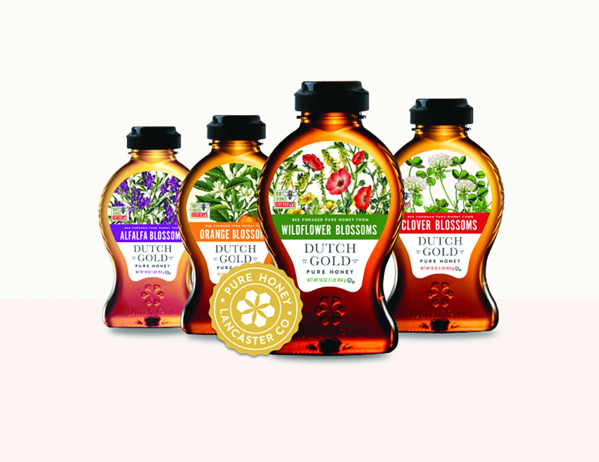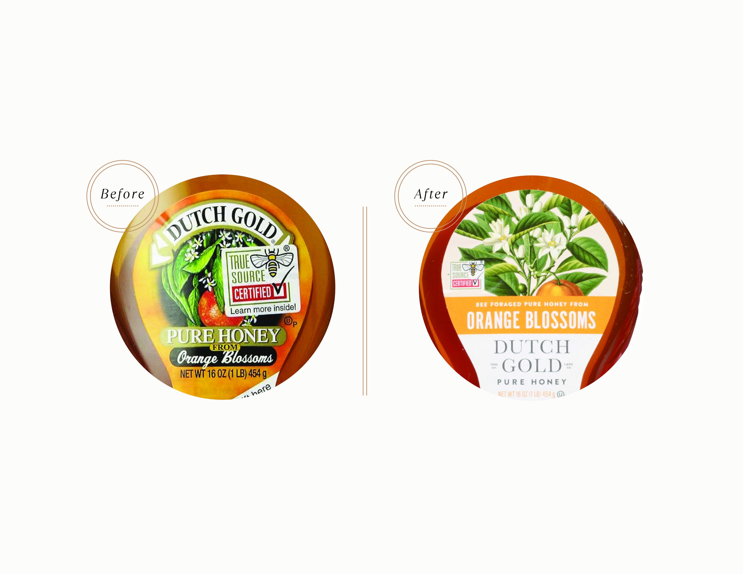
Brand + Packaging RefreshAs a heritage brand with deep family roots, Dutch Gold Honey aimed to modernize its identity while preserving the hard-earned recognition it had built over decades.
Retaining its signature bottle shape, the brand chose a refined facelift rather than a full overhaul. The refresh introduced an updated logo and seal design that captured Lancaster’s charm in a contemporary way, along with newly designed labels featuring warm, colorful botanical illustrations that conveyed a natural feel while honoring its rich heritage. This thoughtful balance of tradition and modernity allowed Dutch Gold Honey to evolve for a new era while staying true to its legacy.